Creative One-Page Website Design Ideas

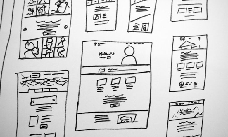
In the digital landscape, where attention spans are fleeting and information overload is commonplace, one-page website design has emerged as a compelling solution for businesses and individuals alike. This design approach consolidates all essential information into a single, scrollable page, allowing users to navigate seamlessly through content without the distraction of multiple pages. The simplicity of one-page websites not only enhances user experience but also streamlines the design process, making it an attractive option for those looking to establish a strong online presence quickly.
One-page websites are particularly effective for showcasing specific products, services, or events. They cater to audiences who prefer quick access to information without the need for excessive clicking or searching. This design format is often employed by startups, freelancers, and creative professionals who want to present their work in a concise yet impactful manner.
By focusing on a single narrative or theme, one-page websites can create a more immersive experience, guiding visitors through a carefully curated journey that highlights key messages and calls to action.
Key Takeaways
- One-page website design is a popular trend that focuses on presenting all content on a single page, providing a seamless user experience.
- Minimalist design approach emphasizes simplicity and clean aesthetics, allowing for easy navigation and focused content presentation.
- Parallax scrolling effects create an engaging visual experience by moving background and foreground elements at different speeds as the user scrolls.
- Interactive storytelling uses animations, videos, and interactive elements to engage users and guide them through the website’s narrative.
- Single-page portfolio showcases allow designers and creatives to display their work in a visually impactful and easily accessible manner.
- Split screen layouts divide the page into two distinct sections, allowing for creative and visually appealing content presentation.
- Vertical navigation menus provide easy access to different sections of the website, enhancing user experience and navigation.
- Call-to-action and contact forms are strategically placed throughout the one-page website to encourage user engagement and interaction.
Minimalist Design Approach
The minimalist design approach is a cornerstone of one-page website design, emphasizing simplicity and functionality. By stripping away unnecessary elements, designers can create a clean and uncluttered interface that directs users’ attention to the most important content. This aesthetic not only enhances visual appeal but also improves usability, as visitors can easily navigate through the site without being overwhelmed by distractions.
The use of ample white space, limited color palettes, and straightforward typography contributes to a serene browsing experience that encourages engagement. In practice, minimalist design can manifest in various ways. For instance, a portfolio website for a photographer might feature a grid of stunning images with minimal text, allowing the visuals to speak for themselves.
Each image could be linked to a brief description or project details that appear upon clicking, maintaining the site’s clean look while providing essential information. This approach not only showcases the photographer’s work effectively but also aligns with the minimalist ethos by prioritizing content over embellishment.
Parallax Scrolling Effects
Parallax scrolling is a dynamic technique that adds depth and interactivity to one-page websites. This effect creates an illusion of three-dimensional space by moving background images at a different speed than foreground content as users scroll down the page. The result is an engaging visual experience that captivates visitors and encourages them to explore further.
Parallax scrolling can be particularly effective in storytelling, as it allows designers to guide users through a narrative in a visually compelling manner. For example, a travel agency might utilize parallax scrolling to showcase various destinations. As users scroll down the page, they could encounter stunning landscapes that shift in perspective, accompanied by descriptive text that fades in and out.
This immersive experience not only captures the essence of each location but also evokes emotions associated with travel and adventure. By integrating parallax effects thoughtfully, designers can create a memorable journey that resonates with users long after they leave the site.
Interactive Storytelling
Interactive storytelling is an innovative approach that transforms passive browsing into an engaging experience. By incorporating elements such as animations, videos, and interactive graphics, one-page websites can invite users to participate in the narrative rather than simply consuming information. This method fosters a deeper connection between the audience and the content, making it more likely that visitors will remember the brand or message being conveyed.
A prime example of interactive storytelling can be found in educational websites aimed at children. These sites often feature animated characters that guide young users through various lessons or activities. As children interact with the content—clicking on objects or answering questions—they become active participants in their learning journey.
This not only enhances retention but also makes the experience enjoyable and memorable. By leveraging interactive storytelling techniques, designers can create one-page websites that resonate with users on multiple levels.
Single-Page Portfolio Showcase
For creative professionals such as artists, designers, and writers, a single-page portfolio showcase serves as an effective means of presenting their work in a cohesive manner. This format allows individuals to curate their projects in a way that tells a story about their skills and experiences while maintaining an organized layout. By featuring selected works prominently on the page, designers can ensure that potential clients or employers quickly grasp their capabilities without sifting through multiple pages.
A well-designed single-page portfolio might include sections dedicated to different types of work—such as graphic design, photography, or writing—each accompanied by high-quality visuals and brief descriptions. For instance, a graphic designer could showcase their best projects in a visually striking grid layout, with each project expanding into a detailed view upon clicking. This approach not only highlights the designer’s versatility but also keeps the user engaged by providing an intuitive browsing experience.
The single-page format allows for easy updates as new projects are completed, ensuring that the portfolio remains current and relevant.
Split Screen Layouts
Maximizing Screen Real Estate
Split screen layouts can be particularly effective in one-page designs where space is limited yet impactful presentation is essential.
Design Benefits
By dividing the screen into two sections, designers can create visual interest while maintaining clarity and focus.
Vertical navigation menus are gaining popularity in one-page website design due to their ability to enhance usability while providing an aesthetically pleasing layout. Unlike traditional horizontal menus that can become cluttered with multiple links, vertical menus allow for clearer organization of content sections. This format is especially beneficial for one-page designs where space is at a premium; it enables users to quickly access different parts of the site without excessive scrolling.
Implementing vertical navigation can also contribute to a more modern look and feel for the website. For instance, a fashion brand might use a vertical menu on the left side of the page to categorize its collections—such as “New Arrivals,” “Best Sellers,” and “Sale.” As users click on each category, they are smoothly scrolled down to the corresponding section of the page. This not only enhances user experience but also maintains visual coherence throughout the site.
Vertical navigation menus can be styled with unique fonts and colors that align with the brand’s identity, further enhancing the overall aesthetic appeal.
Call-to-Action and Contact Forms
Incorporating effective call-to-action (CTA) buttons and contact forms is crucial for one-page website design, as these elements drive user engagement and conversions. A well-placed CTA encourages visitors to take specific actions—whether it’s signing up for a newsletter, requesting more information, or making a purchase. The strategic placement of these buttons throughout the page ensures that users are prompted at key moments during their browsing experience.
For instance, an event planning service might include CTAs such as “Get Started” or “Book Your Consultation” at various points on their one-page site. These buttons could be designed in contrasting colors to stand out against the background while maintaining brand consistency. Additionally, integrating contact forms directly into the page allows users to reach out without navigating away from their current view.
A simple form requesting name, email address, and message can facilitate quick communication while keeping potential clients engaged with the content they were exploring. By thoughtfully designing CTAs and contact forms within a one-page website framework, businesses can significantly enhance user interaction and conversion rates. The seamless integration of these elements not only improves functionality but also reinforces the overall narrative of the site, guiding visitors toward desired outcomes while maintaining an enjoyable browsing experience.


