Minimalist Web Design: 5 Stunning Examples

Minimalist web design is a philosophy that emphasizes simplicity and functionality, stripping away unnecessary elements to create a clean and efficient user experience. This design approach is rooted in the belief that less is more, allowing users to focus on the essential content without distractions. The minimalist aesthetic often features ample white space, straightforward navigation, and a limited color palette, all of which contribute to a streamlined interface.
As digital landscapes become increasingly cluttered, minimalist web design stands out as a refreshing alternative that prioritizes usability and clarity. The origins of minimalist design can be traced back to various art movements, including Bauhaus and modernism, which sought to eliminate excess and highlight the beauty of simplicity. In the context of web design, this translates into websites that are not only visually appealing but also highly functional.
By reducing visual noise, designers can guide users toward their goals more effectively, whether that be making a purchase, signing up for a newsletter, or simply consuming content. As we delve into specific examples of minimalist web design, we will explore how these principles manifest in real-world applications and the impact they have on user experience.
Key Takeaways
- Minimalist web design focuses on simplicity and removing unnecessary elements to create a clean and functional website.
- Clean and simple typography is a key example of minimalist web design, using easy-to-read fonts and ample white space.
- Negative space, or the use of empty space around elements, is another example of minimalist design that helps to create a clean and uncluttered look.
- A limited color palette is often used in minimalist web design to create a cohesive and harmonious visual experience.
- Minimalist navigation and layout prioritize ease of use and intuitive design, making it simple for users to find what they need.
- Emphasizing visual content, such as high-quality images and videos, is another key aspect of minimalist web design that can make a big impact.
- The benefits of minimalist web design include faster load times, improved user experience, and a modern and sophisticated aesthetic.
- Embracing minimalism in web design can lead to a more effective and impactful online presence, helping to communicate a clear and focused message to users.
Example 1: Clean and Simple Typography
Accessibility and Legibility
The use of ample line spacing and generous margins allows the text to breathe, making it more accessible to users. This approach not only improves legibility but also avoids overly ornate or distracting typefaces, aligning with the minimalist ethos.
Hierarchy and Visual Flow
The strategic use of font weight and size can create a clear hierarchy within the content. For example, larger headings can draw attention to key messages, while smaller body text provides supporting information without overwhelming the user. Websites such as Medium exemplify this technique by employing a straightforward typographic system that guides readers through articles seamlessly.
Effective Communication and Aesthetics
By focusing on clean typography, designers can ensure that the message is communicated effectively while maintaining an uncluttered aesthetic.
Example 2: Use of Negative Space
Negative space, or white space, is an essential component of minimalist web design that enhances both aesthetics and functionality. It refers to the empty areas surrounding design elements, which can significantly impact how users perceive and interact with content. By incorporating negative space strategically, designers can create a sense of balance and clarity on a webpage.
For instance, the website for the online retailer Everlane utilizes negative space to highlight its products effectively. Each item is given room to stand out, allowing users to focus on individual pieces without feeling overwhelmed by competing visuals. In addition to improving visual appeal, negative space can also enhance usability by guiding users’ attention toward important elements.
For example, call-to-action buttons can be placed within areas of negative space to make them more prominent and inviting. This technique is evident in the design of Dropbox’s homepage, where ample white space surrounds the primary call-to-action, encouraging users to sign up for the service. By leveraging negative space thoughtfully, designers can create an environment that fosters engagement and facilitates user interaction.
Example 3: Limited Color Palette
A limited color palette is another hallmark of minimalist web design that contributes to a cohesive and sophisticated look. By restricting the number of colors used on a website, designers can create a unified visual identity that enhances brand recognition while minimizing distractions. For example, the website for the luxury fashion brand Gucci employs a carefully curated color scheme that reflects its brand ethos—elegance and exclusivity—while maintaining a minimalist aesthetic.
The use of muted tones alongside bold accents allows key elements to stand out without overwhelming the viewer. Furthermore, a limited color palette can evoke specific emotions and associations that resonate with users. For instance, blue is often associated with trust and reliability, making it a popular choice for financial institutions and tech companies.
In contrast, warmer colors like red or orange can evoke feelings of excitement or urgency. The website for Airbnb exemplifies this principle by using a warm color palette that creates an inviting atmosphere while maintaining simplicity. By thoughtfully selecting colors that align with their brand message, designers can enhance user experience and foster emotional connections with their audience.
Effective navigation is critical in web design, as it directly impacts how users interact with content. Minimalist web design advocates for straightforward navigation systems that prioritize ease of use. Websites like Google exemplify this approach with their simple navigation bar that features only essential links.
By eliminating unnecessary options and focusing on core functionalities, users can quickly find what they need without feeling overwhelmed by choices. In addition to navigation, layout plays a significant role in guiding user behavior on a website. A minimalist layout often employs grid systems that create visual order and consistency across pages.
For instance, the website for the online portfolio platform Behance utilizes a grid layout that showcases creative work in an organized manner. Each project is presented within its own space, allowing users to browse effortlessly while maintaining focus on individual pieces. This combination of minimalist navigation and layout not only enhances usability but also reinforces the overall aesthetic appeal of the site.
Example 5: Emphasis on Visual Content
Visual Content as Storytelling
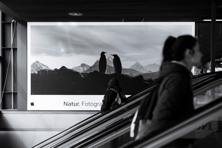
The emphasis on visual content extends to storytelling through imagery. National Geographic’s use of breathtaking photography is a prime example, drawing users into its narratives about nature and culture. Each image is carefully selected to evoke emotion and curiosity, adhering to a minimalist approach that avoids clutter.
Creating Immersive Experiences
By prioritizing visual content, designers can create immersive experiences that resonate with users on a deeper level. This approach enables designers to craft engaging narratives that captivate users, making their online experience more memorable.
Benefits of Minimalist Web Design
The benefits of minimalist web design extend beyond aesthetics; they encompass usability, performance, and user satisfaction as well. One of the primary advantages is improved load times. Websites with fewer elements tend to load faster because there are fewer resources for browsers to process.
This is particularly important in an era where users expect instant gratification; slow-loading sites can lead to high bounce rates and lost opportunities. Additionally, minimalist designs often lead to enhanced user engagement. By reducing distractions and focusing on essential content, users are more likely to interact with key elements such as calls-to-action or product listings.
This increased engagement can translate into higher conversion rates for businesses looking to drive sales or sign-ups. Furthermore, minimalist designs are often more accessible across various devices and screen sizes due to their simplicity; responsive design becomes easier when there are fewer elements to adapt.
Embracing Minimalism in Web Design
Embracing minimalism in web design is not merely about adopting a specific aesthetic; it represents a fundamental shift in how we approach user experience and content delivery. As digital environments continue to evolve, the principles of minimalist design offer valuable insights into creating effective websites that prioritize clarity and functionality. By focusing on clean typography, strategic use of negative space, limited color palettes, straightforward navigation, and compelling visual content, designers can craft experiences that resonate with users while achieving business objectives.
The growing popularity of minimalist web design reflects a broader cultural movement toward simplicity in our increasingly complex world. As users become more discerning about their online experiences, embracing minimalism may be key to standing out in a crowded digital landscape. Ultimately, minimalist web design serves as a reminder that sometimes less truly is more—an ethos that can lead to more meaningful interactions between brands and their audiences.


